April 10, 2015
Now that I’m in this business as a vendor, I realize how impactful the colors for your wedding can be. Picking a color scheme for your wedding can be challenging and overwhelming, but I’m here today to help you make the process a little easier!
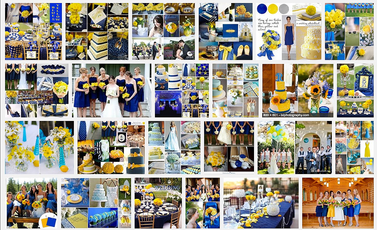
So you’ve been imagining this day since you were young, or at least since you discovered Pinterest (go ahead – you can follow us! 😉 ). If you were like me, you envisioned yellow flowers and navy blue dresses – errrrr – that is until years later when I took a moment to google “yellow and navy blue wedding.” Suddenly all I could think of was the University of Michigan – to me, it seemed a bit bold. Takeaway here – usually if they’re football colors – they’re probably a bit bold for a wedding color palette – just my opinion. 😉 The yellow and blue wasn’t giving off the softer, spring vibe I was envisioning.
So fast forward a few years, once I had a few weddings under my belt and my facebook newsfeed became a scrolling issue of The Knot and Style Me Pretty.
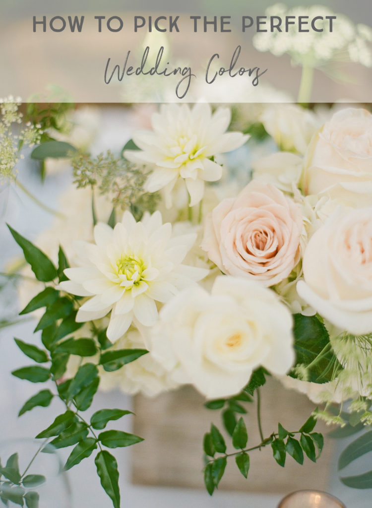
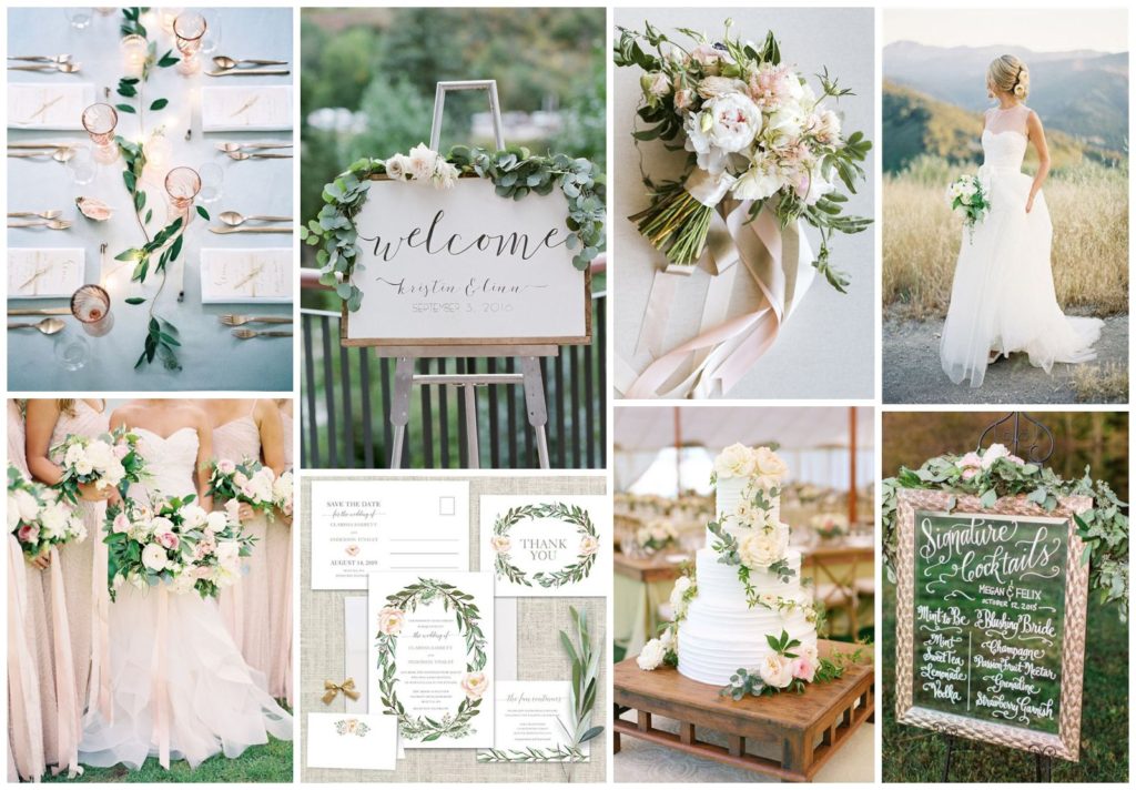
My vision adjusted. I loved the look of weddings with soft color pallets – pastels and neutrals became my go to.
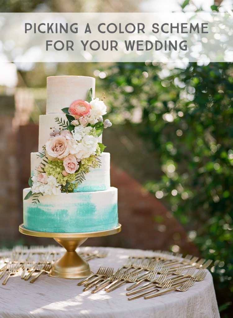
I had a vision in my mind of what kind of vibe I wanted. You know what I did next? (Here is where I had an unfair advantage as a photographer because I got to test run my perfect wedding.) I did a styled shoot. I put together my dream wedding with its soft color pallet and watercolor inspiration.
Do you know how I came up with the idea? I forced myself to make separate inspiration boards on Pinterest. I made a “something blue” board. I made a “watercolor wedding” board. I stated a “Florida citrus” board. I wanted to be exposed to different options and to see which images I got the most excited about. Yes, my hunch was right – I knew pastels and creamy tones were it for me – but I wanted to be sure.
When you are using Pinterest, be mindful of how many pins you show your wedding planner or wedding stylist. Pin all you want, but when you are getting ready to share your board, narrow it down to your top pins – maybe 20 or so. Make sure each image has a purpose – that there is something specific you like about every photo. Your planner or stylist will help guide your vision and narrow the scope of what you’re looking for. In the end, your vision board will probably have between 4-6 photos. (I haven’t totally gone through this process yet – I’m still at the hundreds of pins stage…gahhhh!) Those 4-6 photos will be shared with all of your vendors to make sure the elements they are delivering match up with the theme of the wedding.
So are we recreating our styled shoot for our wedding? Not exactly. There will be similar elements I’m sure – painted invitations, a watercolor map, soft, asymmetrical and textured florals, but there will be a more earthy feel to flow with the vibe of our venue. I believe that more greens will appear in ways of ferns, succulents, or rosemary. But pastels will complement the vibe throughout the event. (Also, apologies – I do not know who photographed all of the images below – snagged ’em all from Pinterest.)
My last piece of advice for you when picking a color scheme is to look at Burnett’s Boards. She creates “mood boards” that you can search for by color pallet. What are you drawn towards? Which boards evoke the mood you are going for?
If you’re like me, you’ll change your mind a time or two – but at least when you make a final decision, you’ll know it was the right one.
Was this helpful? Take a peek at our other blogs with tips for brides!
Hugs!